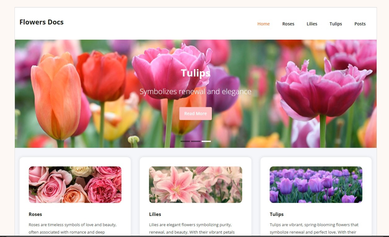
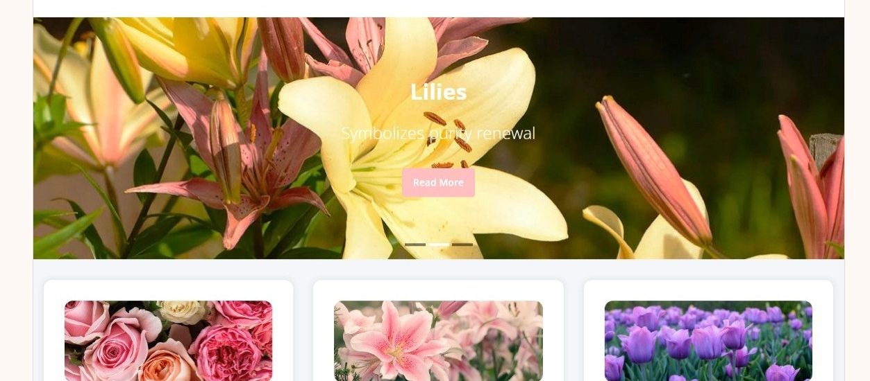
This Flowers Docs website is a beautifully structured and content-focused platform designed to showcase the beauty, symbolism, and information about various types of flowers. The homepage features a large, eye-catching image slider that rotates through different flowers—each one accompanied by a meaningful phrase and a soft “Read More” button. The current highlight is “Lilies,” which are gracefully introduced with the phrase “Symbolizes purity renewal,” creating a gentle and inviting feel right from the start.
The site uses a clean, soft color scheme that fits the theme of nature and elegance. The navigation bar at the top makes it easy for users to explore content categories like Roses, Lilies, Tulips, and Posts. Just below the slider, three neatly designed cards introduce the featured flowers. Each card contains an image, a title, and a short description to engage the visitor and encourage further exploration. The rounded corners, light drop shadows, and use of white space give the layout a modern and fresh appearance.
This project was built with user experience in mind, combining a simple UI with informative content. It’s ideal for flower lovers, bloggers, or educational purposes. It also shows your ability to structure a visually pleasing site while organizing content in a way that’s easy to digest. Whether you want to scale it with more flower categories or turn it into a full educational blog, the foundation is strong, responsive, and beautifully themed. This project is a great example of clean frontend design paired with thoughtful content presentation.